[It's me] JobSlider
by 한만섭
JobSlider
검색 페이지에서 구하고 싶은 직무를 선택하는 Slider입니다. 아래와 같은 상태를 목표로 제작해보겠습니다.
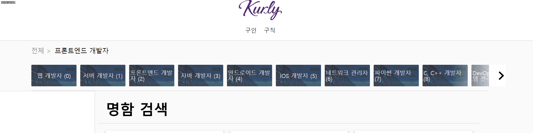
1. 컴포넌트 구조
-
Wrapper
-
SelectedJobContainer
- SelectedJob
-
JobListContainer
- JobList
- JobCard
- RightButtonContainer
- LeftButtonContainer
- JobList
-
위와 같은 구조로 구성할 수 있습니다.
1.1 Wrapper
JobSlider을 감싸고 있는 Container의 역할을 해줍니다.

1.2 SelectedJobContainer
현재 선택된 직무를 표시해주는 부분을 감싸는 컨테이너역할을 합니다.

1.2.1 SelectedJob
전체 > “ 선택된 직무” 부분에 들어갈 역할을 맡고 있습니다.

1.3 JobListContainer
직업 카드 리스트를 담고 있는 컨테이너 입니다. 왼쪽 화살표 버튼과 오른쪽 화살표 버튼을 담고 있습니다.

1.3.1 JobCard
직업 카드 하나를 나타내는 컴포넌트 입니다.

1.3.2 RightButtonContainer

1.3.3 LeftButtonContainer

2. 코드 리뷰
import React, { useState } from "react";
import styled from "styled-components";
import Theme from "../Styles/Theme";
import { RightIcon, LeftIcon } from "./Icons/Commons";

const Wrapper = styled.div`
  margin: 0px 8vw;
  height: 140px;
  display: grid;
  grid-template-rows: 4fr 6fr;
  border-bottom: ${Theme.boxBorder};
`;

const SelectedJobContainer = styled.div`
  color: #999;
  display: flex;
  align-items: center;
  font-size: 18px;
`;

const SelectedJob = styled.div`
  margin-left: 10px;
  color: black;
  font-weight: 500;
`;

const JobListContainer = styled.div`
  align-items: center;
  display: flex;
  overflow: hidden;
`;

const JobList = styled.div<{ selectedPage: number }>`
  display: flex;
  transition: all 0.3s ease-in-out;
  transform: translateX(-${props => props.selectedPage * 10}%);
`;

const JobCard = styled.div`
  display: flex;
  justify-content: center;
  align-items: center;
  width: 126px;
  height: 60px;
  background-image: url("https://static.wanted.co.kr/images/tags/468d23ec-43fa-11e6-90dd-0a30d591bfc5.jpg");
  border-radius: 2px;
  padding: 0px 3px;
  color: rgba(255, 255, 255, 0.8);
  margin-right: 10px;
  cursor: pointer;
`;

const Button = styled.div`
  display: flex;
  align-items: center;
  width: 150px;
  height: 60px;
  position: absolute;
`;

const RightButtonContainer = styled(Button)<{ isShow: boolean }>`
  display: ${props => (props.isShow ? "flex" : "none")};
  right: 5vw;
  justify-content: flex-end;
  background: linear-gradient(90deg, rgba(255, 255, 255, 0), white);
  cursor: pointer;
`;

const LeftButtonContainer = styled(Button)<{ isShow: boolean }>`
  display: ${props => (props.isShow ? "flex" : "none")};
  background: linear-gradient(90deg, white, rgba(255, 255, 255, 0));
  left: 5vw;
  cursor: pointer;
`;

const JobSlider = () => {
  const Jobs = [
    "웹 개발자",
    "서버 개발자",
    "프론트엔드 개발자",
    "자바 개발자",
    "안드로이드 개발자",
    "IOS 개발자",
    "네트워크 관리자",
    "파이썬 개발자",
    "C, C++ 개발자",
    "DevOps / 시스템 관리자",
    "Node.js 개발자",
    "PHP 개발자",
    "보안 엔지니어",
    "테스트 엔지니어",
    "머신러닝 엔지니어",
    "루비온레일즈 개발자",
    "빅데이터 엔지니어",
    ".NET 개발자",
    "웹 퍼블리셔",
    "임베디드 개발자",
    "블록체인 엔지니어"
  ];
  const [selectedJob, setSelectedJob] = useState("프론트엔드 개발자");
  const [selectedPage, setSelectedPage] = useState(0);
  console.log("selectedPage", selectedPage);
  return (
    <Wrapper>
      <SelectedJobContainer>
        {"전체 >"}
        {selectedJob && <SelectedJob>{selectedJob}</SelectedJob>}
      </SelectedJobContainer>
      <JobListContainer>
        <JobList selectedPage={selectedPage}>
          {Jobs.map((job, index) => (
            <JobCard onClick={() => setSelectedJob(job)} key={index}>
              {job} ({index})
            </JobCard>
          ))}
        </JobList>
        <RightButtonContainer
          isShow={selectedPage < 6 ? true : false}
          onClick={() => setSelectedPage(selectedPage + 1)}
        >
          <RightIcon fill={"black"}></RightIcon>
        </RightButtonContainer>
        <LeftButtonContainer
          isShow={selectedPage > 0 ? true : false}
          onClick={() => setSelectedPage(selectedPage - 1)}
        >
          <LeftIcon fill={"black"}></LeftIcon>
        </LeftButtonContainer>
      </JobListContainer>
    </Wrapper>
  );
};

export default JobSlider;
전체코드 중에서 중요한 부분만 정리하도록 하겠습니다.
2.1 Wrapper
grid 속성을 이용해서 세로로 4:6비율을 가진 컴포넌트로 제작했습니다.
const Wrapper = styled.div`
  margin: 0px 8vw;
  height: 140px;
  display: grid;
  grid-template-rows: 4fr 6fr;
  border-bottom: ${Theme.boxBorder};
`;

2.2 JobList
직업 리스트는 현재 선택된 page를 기준으로 transform: translateX에 값을 넣어주어서 slide되는 모션을 구현했습니다.
const JobList = styled.div<{ selectedPage: number }>`
  display: flex;
  transition: all 0.3s ease-in-out;
  transform: translateX(-${props => props.selectedPage * 10}%);
`;
아래 코드는 왼쪽 버튼과 오른쪽 버튼을 눌렀을 때 selectedPage의 값을 변경 시켜주는 부분입니다.
  <RightButtonContainer
          isShow={selectedPage < 6 ? true : false}
          onClick={() => setSelectedPage(selectedPage + 1)}
        >
          <RightIcon fill={"black"}></RightIcon>
        </RightButtonContainer>
        <LeftButtonContainer
          isShow={selectedPage > 0 ? true : false}
          onClick={() => setSelectedPage(selectedPage - 1)}
        >
          <LeftIcon fill={"black"}></LeftIcon>
        </LeftButtonContainer>
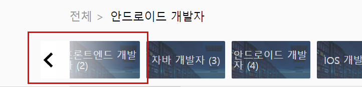
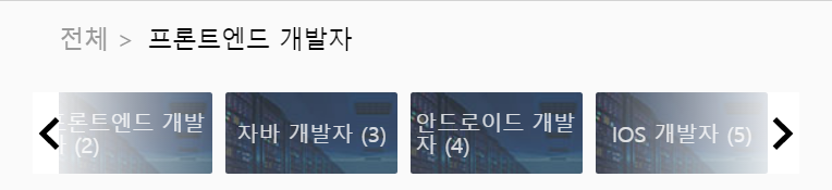
추가적으로 첫 페이지에서는 왼쪽화살표버튼이 안보이고 마지막 페이지에서는 오른쪽 화살표버튼이 안보이도록 작성하기 위해 styled-component에 isShow라는 prop를 넘겨주어서 컴포넌트의 상태를 관리했습니다.
const RightButtonContainer = styled(Button)<{ isShow: boolean }>`
  display: ${props => (props.isShow ? "flex" : "none")};
  right: 5vw;
  justify-content: flex-end;
  background: linear-gradient(90deg, rgba(255, 255, 255, 0), white);
  cursor: pointer;
`;

const LeftButtonContainer = styled(Button)<{ isShow: boolean }>`
  display: ${props => (props.isShow ? "flex" : "none")};
  background: linear-gradient(90deg, white, rgba(255, 255, 255, 0));
  left: 5vw;
  cursor: pointer;
`;
이렇게 하게 될 경우 아래와 같이 처음에는 왼쪽 버튼이 보이지 않습니다.

2.3 Left / Right Button
기본적인 Button을 상속(?) 받아서 왼쪽 오른쪽 버튼을 만들었습니다. 아래와 같이 좀더 자연스러운 느낌을 주기 위해서 linear-gradient를 사용해서 효과를 주었습니다.
const Button = styled.div`
  display: flex;
  align-items: center;
  width: 150px;
  height: 60px;
  position: absolute;
`;

const RightButtonContainer = styled(Button)<{ isShow: boolean }>`
  display: ${props => (props.isShow ? "flex" : "none")};
  right: 5vw;
  justify-content: flex-end;
  background: linear-gradient(90deg, rgba(255, 255, 255, 0), white);
  cursor: pointer;
`;

const LeftButtonContainer = styled(Button)<{ isShow: boolean }>`
  display: ${props => (props.isShow ? "flex" : "none")};
  background: linear-gradient(90deg, white, rgba(255, 255, 255, 0));
  left: 5vw;
  cursor: pointer;
`;
2.4 직업 선택
카드를 누르면 selectedJob state를 변경시켜줍니다.
 <JobCard onClick={() => setSelectedJob(job)} key={index}>
              {job} ({index})
            </JobCard>
2.5 반응형
아래 이미지처럼 작은 화면에서도 동작할 수 있도록 px값이 아닌 vw값을 사용해서 작성했습니다.
const Wrapper = styled.div`
  margin: 0px 8vw;
 (...중략...)
`;

const RightButtonContainer = styled(Button)<{ isShow: boolean }>`
  display: ${props => (props.isShow ? "flex" : "none")};
  right: 5vw;
 (...중략...)
`;
Subscribe via RSS